
TMP: Brand Direction
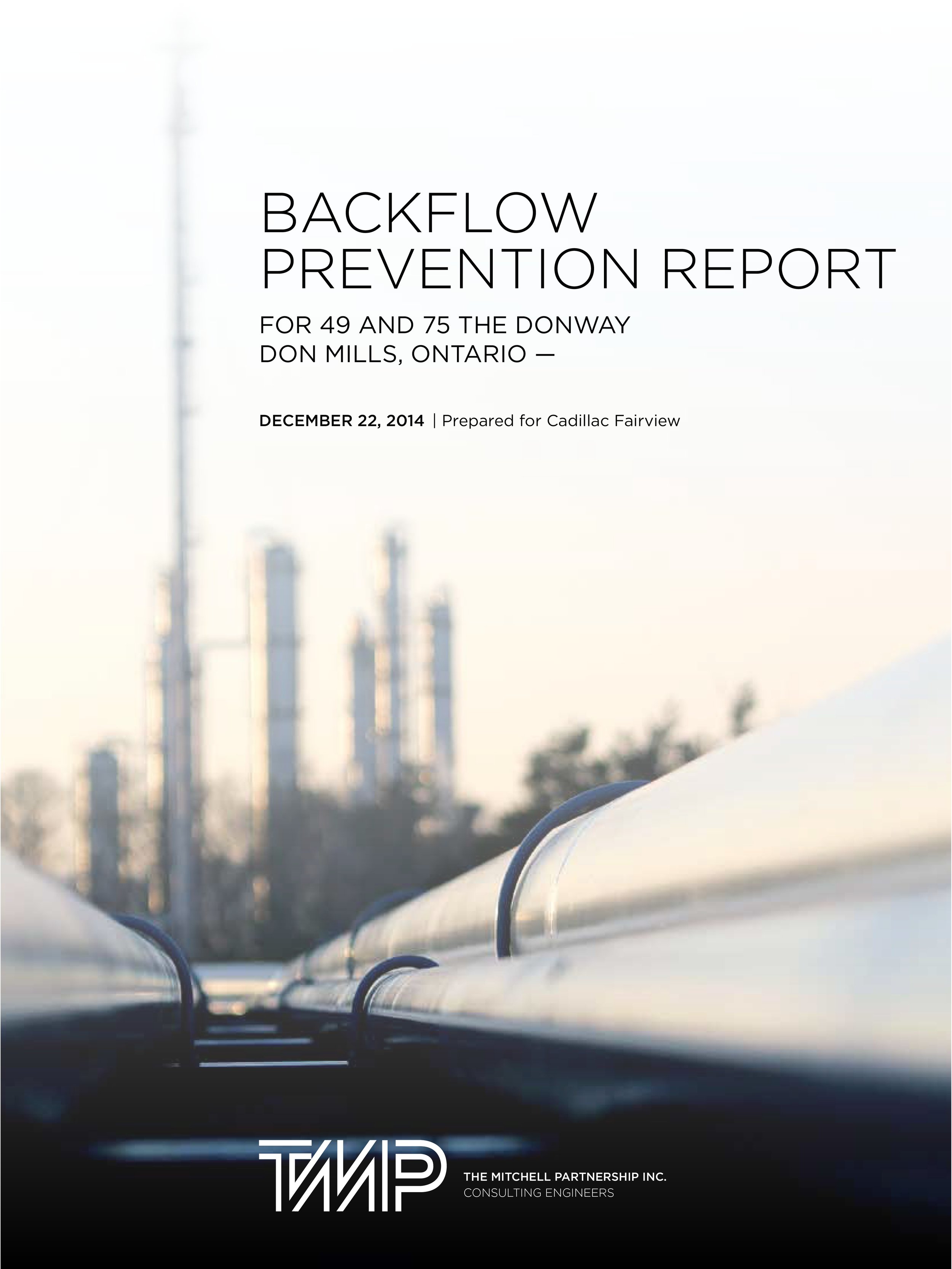
The Mitchell Partnership is a mechanical engineering firm who wanted to rebrand. After a visual audit, I felt strongly their existing wordmark was solid; they just needed some direction to build creative assets. Proposed retaining black + white as a base, allowing colour to come forward from imagery.
Included developing some language around the symbolism of line—the point of a moving path, and its fundamental characteristic is to connect.
Creative direction x template design:
+ Letterhead, memo, pocket folders, business cards
+ Project profiles
+ Curricula vitae
+ Site reports
+ Presentations
See also: TMP Signage
Creative Direction, Graphic Design, Image Sourcing


“Your amazing design work played a big role in helping us leveraging it over the past 10 years.”
– Managing Director
“I really like your creative direction and would like to further develop some design ideas. It’s been an absolute pleasure working with you and we really appreciate the time you’ve taken to ensure TMP embraces a design reflective of our brand.”
– Marketing Coordinator