
HFR: Creative Direction
BRAND—a high-frequency rail bid between Ontario (ON) and Quebec (QC). With a global team, it required a new consortium logo to brand the submission. Focused on the word “connection” and abstract lines (that geographically motion the route between the two destinations).
COVERS x TABS—the premise was to show a progression, starting with outdoor imagery, move inside to the rail platform, and end with passengers.
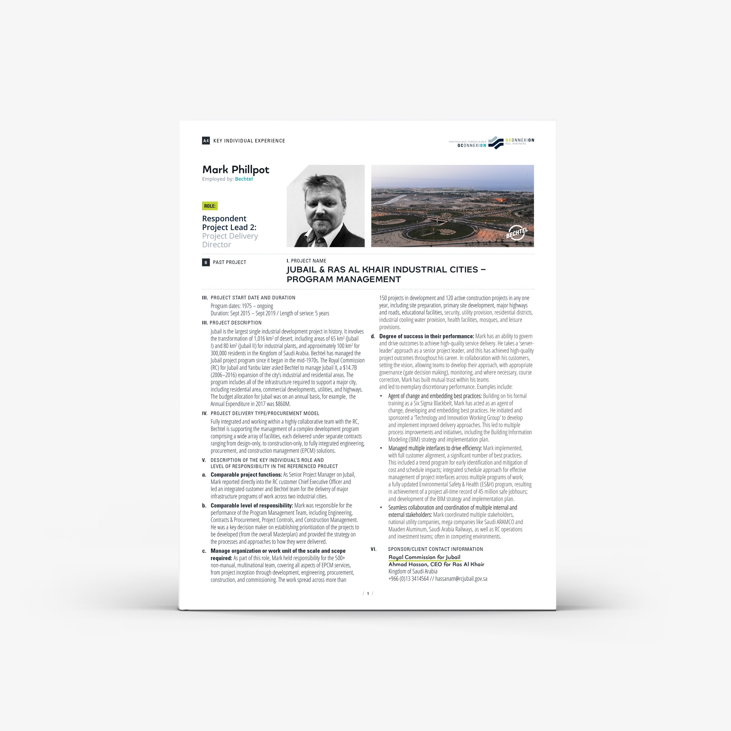
NARRATIVE TEMPLATE—with a 15-page maximum restriction; specific margins and font size help maximize content and retain white space. Spacing adjusted to allow for larger titles, by using a table—that clearly identifies the ask, and answer.
Included direction for simplified infographics, CV layout and LESSONS LEARNED section.
Creative Direction, Graphic Design, Image Sourcing, Infographics


“Thanks again for the support throughout the RFQ response. The team loved the colour, look and feel of the submission.”
– Principal, Bid Lead